
3D prototype
visual research
narrative research
January 24-31
competitive analysis
brand identity: color, logo, values, imagery, type
competitive analysis
Insight Housing
-very similar to subject of my project: housing authority, sustainable housing, community building
-bold bright wide range of colors feel playful, friendly, lively
-blue logo vs site colors. blue+green feel calm, secure, polite. vs bright wide range feels more intense and excited. I like bright warmer color and passionate feeling rather than blue/green neutral feeling
Metro Housing
-Boston housing authority— very similar to my project.
-round vector shapes for organization and displaying images/text. gives friendly humanly feel
-logo of combining building+ppl figures
-wide range rainbow logo / color scheme. friendly approachable human feel. could be warmer and more passionate I feel for me

who I looked at:


Tyne Housing
-line illustrations identifiable, friendly, approachable,
-calm blue and greens are similar friendly approachable feeling. I like this feeling, would like for myself a more excited passionate feel
-big bold scale and color organizing. easy to navigate, read, understand,
-photos are nice personalized
Rockford Housing
-contemporary looking housing authority
-sharp, clean, serious sterile look
-housing ref in logo, pattern
-wide range rainbow logo / color scheme. friendly approachable human feel
-minimalism small scaling makes feeling serious, unapproachable, not somewhere/someone id feel comfortable reaching out to very much


brand identity:
personality: passionate, active, present
-warm color, round shapes, big scale
target audience: for entire public. is a public service, start w simplest straight forward 6th-8th grade language. Americans.
informational: in cities, 25+: those with disposable income and spare time. All income groups.
resources: simpler, smaller, different locations,
purpose + values: housing activism. humanizing unhoused, tenant rights>civil, organizing events and community, volunteering in events, donation events
community driven: personalized, friendly, we language, call to action
activist: govt critical, call to action

color:
all examples are public service ex hosplital, school, instituitions, library, housing aithorities, , mbta.
blue gives a professional, clean, friendly, polite passive sort of feeling. very similar colors of blues, yellow accent.
-i like insight for its warm and bright colors, to me that feels more passionate, acivated, energentic, and community oriented than the blues. I want org to be loud and present


logo:
-so so very used is silhouette/ linework/ negative space and square body triangle roof
-I like site specificity for community unique a part of something feeling
-abstracting forms of architecture like orange and white, yellow and pink, rockford—feel like building but isn’t standard square triangle
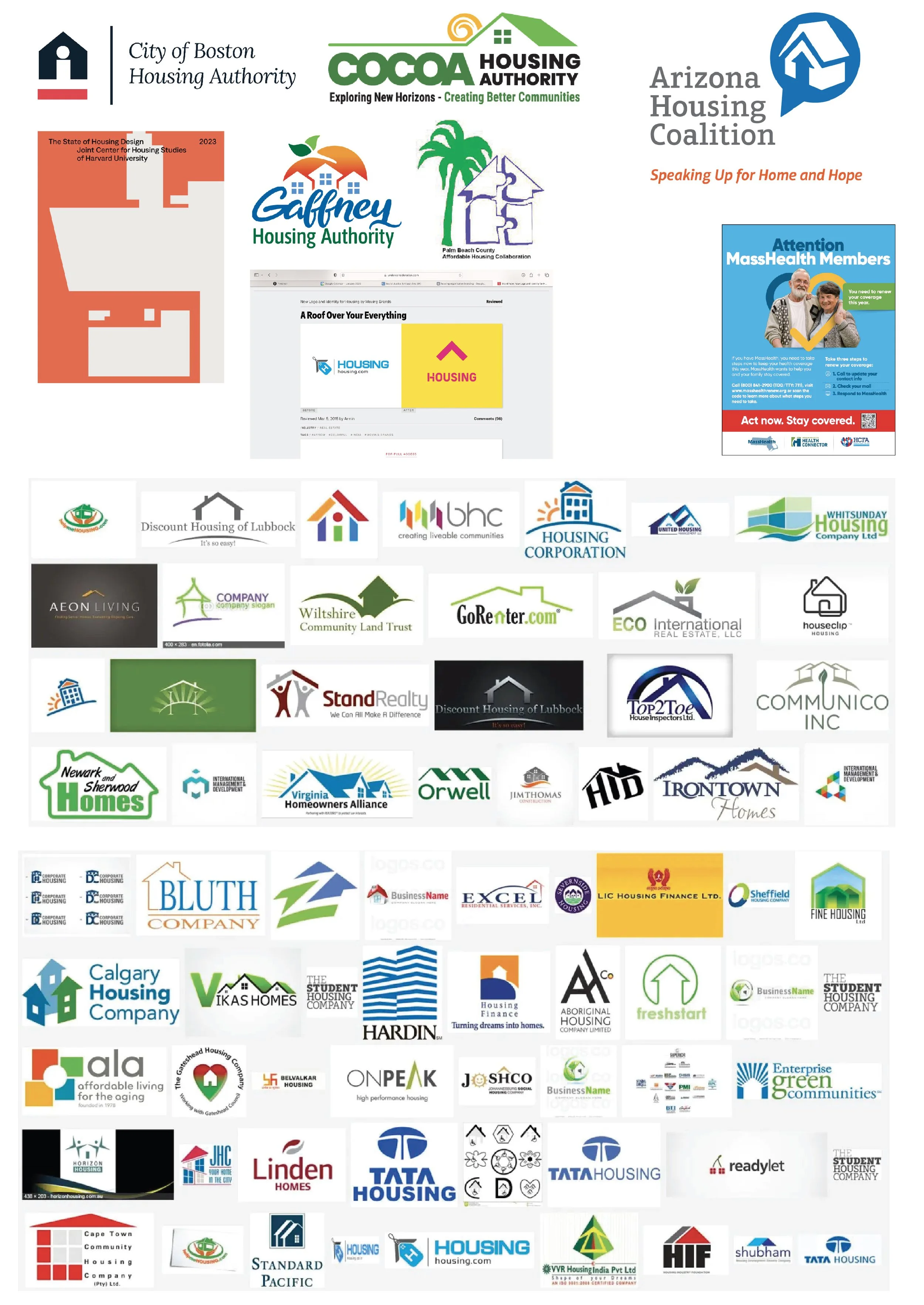
all house related businesses

ones I like and why I like them
values:
community
humanizing unhoused
rights for unhoused
rights for tenants
rights>democracy>architecture


type:
-simple, clean, easy to read, accessible> sans serif, soft, geometric, solid
-6-8 grade reading lvl
-

imagery:
rights>democracy
housing>architecture
democracy+architecture=
neoclassicism +/ federal modernism
community+activism
self made, homemade, anyone could make
+typical protest imagery=
Lino cut/ relief. homemade, friendly, active, inclusive, assoc w protest posters and activism
neoclassicism
grand scale for authority and power, simple geometric forms, symmetry, Roman influence so associated w democracy, dramatic use of columns. decoration
https://www.architecture.com/explore-architecture/Neoclassical


federal modernism
sharp edges, large scale for power, symmetry, emphasized functionality and efficiency, prefabricated elements and inexpensive materials such as aluminum, concrete, and plastic. The lower cost of building in the modernist style helped it become widespread. no decoration.

visual research:
work I find that meet these traits and inspire me:
large scale, symmetry, geometric, sharp, columns, prefabricated. these traits in type, layout, illustration, material
lino as material: protest, activism, democracy
feeling of power, active, passion


narrative research:
3D prototypes:
character illustration:
anthropomorphized. happy neutral silly loose personalized humanized personality
goal of character is consumer humanizes them, empathizes with them, make as complex and human as every person is.